When i first go this project i was excited by the music project available but i now realise this is mainly because i was coming out of a music related project, i now feel that another project would of tested my abilities more.
I started the project with optimism and felt i did well at the beginning however with several holidays (3 week break) being after the brief in it dampened my spirits and initial thoughts about what i could do with the projects set. When researching i swayed towards the musical scene graphic design and forgot that i was doing something for a charity, this confused my ideas because i had certain type of ideas but felt they were too "out there" for a charity design. When the time for the presentation came i felt unprepared due to this confusion of ideas however i felt i got a design direction out of my presentation which was the Saul Bass style, i had done a Saul Bass project in first year college and i researched him before so i knew a fair bit about him and i believe this helped me develop my designs.
Throughout the design and development stage i struggled with ideas, i wanted to have a brave new style but i also knew that it was for charity so it couldnt be too much. After a while i did get the ball rolling and start to understand the style i was going for more, i was able to create outcomes much more effectively and with better quality.
If i had to do this project again i wouldnt choose the music related one, i feel that because i was excited by my last project which was music based that this one would be just as good however i didnt enjoy the "charity" part of it. I think if i went for another project such as the annual report i could have designed better outcomes which would have a more charity feel to them. Overall i was rate my efforts on this project high, the flame started to die out throughout the middle stage but near the end it was reignited to complete the project.
Thursday 16 June 2011
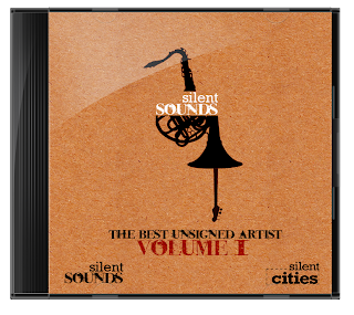
Album Booklet!
So i have more time left than i thought so i have created a booklet that comes inside the album, it tells you information about each band so you can hear more of their music and find out more about them.
I was inspired by this image..
 The bottom left image with the number 5.
I had an idea in my head of the number being over the picture of the band with the information underneath. I created this idea and it looks exactly how i wanted it.
The style of the booklet is more corporate and used the corporate colours more.
The numbers are the number in which they appear on the album.
the front and back

page 1 and 2

page 3 and 4

page 5 and 6

page 7 and 8

page 9 and 10

page 11 and 12

I was inspired by this image..
I had an idea in my head of the number being over the picture of the band with the information underneath. I created this idea and it looks exactly how i wanted it.
The style of the booklet is more corporate and used the corporate colours more.
The numbers are the number in which they appear on the album.
the front and back

page 1 and 2

page 3 and 4

page 5 and 6

page 7 and 8

page 9 and 10

page 11 and 12

Completed designs
The designs are now complete and here they are..
Stage 1: advertise to get bands.


Stage 2: Album creation

Stage 3: Brochure to charities
PICTURE OF BROCHURE HERE
Stage 3b: Posters to advertise the sale of the album


Stage 1: advertise to get bands.


Stage 2: Album creation

Stage 3: Brochure to charities
PICTURE OF BROCHURE HERE
Stage 3b: Posters to advertise the sale of the album


I havent used the corporate orange as such but i tried to have orange coloured cardboard throughout my design, i felt orange was a bit flash and bright for my designs however the orange colour would be on the website. I wanted these designs to have a eco/hand made look so i used the cardboard texture and Saul Bass style to try and get it.
Near completion
So i have just got to rap everything up now. I have all the designs done and now i just need to create the vectors of the guitars/trombone /saxophone and to import it into illustrator for the text.
Monday 13 June 2011
The album imposed
Back to the album.
I have super imposed the designs to look like they are actually on a album case.

I have super imposed the designs to look like they are actually on a album case.


Posters to advertise
These posters will put advertising the first album to the public. I took the previous designs i had done and reworked them to keep it consistant. These may not be my finals but it gives me an idea of where i can go with them.
 Im not sure about this one as its more of an experimental design.
 Again an experimental design but i like this one.

All these posters are in the style of Saul Bass. With these posters i wanted to create a style not seen before or not often therefor i tried to experiment and create something different, i believe i have done this and it is supposed to represent the album and the charity by saying "we are different".


All these posters are in the style of Saul Bass. With these posters i wanted to create a style not seen before or not often therefor i tried to experiment and create something different, i believe i have done this and it is supposed to represent the album and the charity by saying "we are different".
album designs update
Looking back at the album design im not too keen on them so i updated them to look more like the brochure.
The front
i changed the logo so its not on overlay and is back to normal.

The back
I really didnt like the old one so i used a technique i did in the brochure and put it on this.

The CD

The front
i changed the logo so its not on overlay and is back to normal.

The back
I really didnt like the old one so i used a technique i did in the brochure and put it on this.

The CD

The brochure creation
With the brochure i got straight into creating it, i felt that doing it on the mac whilst jotting a few rough sketches and notes were the best idea to do it.
Its a 4 page brochure that will be sent to charities and try to persuade them to sign up to this project.
Front and back.

page 1 and 2

Page 3 and 4

Page 5 and 6

Its a 4 page brochure that will be sent to charities and try to persuade them to sign up to this project.
Front and back.

page 1 and 2

Page 3 and 4

Page 5 and 6

The brochure explains what the silentsounds project is about, what the project has done so far, the dreams of the project, its goal and future predictions, it also has a few images with text that relate to the people its trying to help because i dont want people to forget that its about helping the silent society as well as the charities and unsigned musicians.
Sunday 12 June 2011
The Album
I want the album to have the cardboard feel to it just like the posters, this style has that "no expense bared" look and suits a charity design. I have kept the same style going throughout the album cover which is the same as the posters.
The Front

The Back


The Front

The Back

The CD

New Posters
Ive updated my posters and these are two new ones are maybe the finals.

 Im still to create the silhouettes but i have made the guitar, the guitar is in the style of Saul Bass.
When i research Saul Bass i liked the TRON posters and i felt to give it a try and recreate that style..
 This design would make me able to use the corporate orange much better but i dont think its as strong as other outcomes i have therefor i wont be continuing this design.


When i research Saul Bass i liked the TRON posters and i felt to give it a try and recreate that style..

Saturday 11 June 2011
Feedback
The feedback for my designs gave me something to think about.
Things said:
- Logo change, keep it in the same style as silent cities.
- Use orange (corporate colour)
- The saul bass design was liked more and told to run with this concept.
Things said:
- Logo change, keep it in the same style as silent cities.
- Use orange (corporate colour)
- The saul bass design was liked more and told to run with this concept.
New posters
These posters i went back to my Saul bass influence and built it on that.
 This poster style looks much more professional, i felt the other ones lacked in the other ones lacked in this department.
I will show all my posters in the presentation and see what is said.

I will show all my posters in the presentation and see what is said.
Poster Designs
When i created these i had in mind that they would be put around a bar which plays live music. These posters would be advertising to unsigned artist that they have an opportunity for them.
 This was the main poster but it has a lot of copy on it but i thought that this could be a flyer instead.

 These 2 posters are revisited versions of the original one but i tried to address different audiences because i realised that genre audiences are so vast its hard to reach all e.g. guitars may not be liked by the hip hop/rap side therefor i did different musical instruments. I wanted the designs to be creative, fun and fresh, i didnt want to recreate the image of a charity and people view them.
 In my research i found a vector of a woman with headphones on and i loved the "Wow" factor even though that image only had the headphones to link it with music i was going todo the same but i felt i was pushing this concept a bit too far and that people may not understand my idea and start judging it badly. I Stopped with this design and wont take it any further.
--------------------------------------------------------------
This is the logo that i quickly created however it may be changed.


--------------------------------------------------------------
This is the logo that i quickly created however it may be changed.
Development start
My development will follow the path of the stages, i will create stage 1 first which is the posters to advertise to bands, stage 2 is the CD album creation and stage 3 is the brochure to charities and posters to the public.
Additional extras if i have time will be:
- For stage 1 direct mail
- For Stage 2 website mock up.
Additional extras if i have time will be:
- For stage 1 direct mail
- For Stage 2 website mock up.
Saul Bass designs


I really like this set of posters, i could do this with instruments and i think it would look really good.


I found these few designs of Saul Bass' and i think his style can fit any occasion, i also feel that this style is so different that it can break the visual clutter.
Im not going to talk too much about these but ill refer back to them a lot when designing.
The imperfection seen with his cut out style relates a lot to the bands im promoting and the people we are trying to help.
Album promotion research


I started looking at album promotion poster and realised that they are all in their own style, some dont even feature anything todo with music e.g. the Franz Ferdinand poster above. Therefor i think im going to find a style and do something with that, i quite like the birds poster above which is a Saul Bass style.
OXJAM
What is Oxjam?
Oxjam is Oxfam's month-long music festival. It runs all through October with hundreds of events around the UK, all organised by volunteers who know and love their local music scene, all raising money to save lives around the world.
Website copy:
"Rock. Jazz. Classical. Dance. Whatever you're into, your Oxjam event is what you want it to be. And if you don't yet feel ready to organise your own event, there are loads of other ways to get involved with Oxjam and be a part of the UK's biggest festival line up"


It seems that Oxjam is my silentsounds but a more advanced version, this Oxjam is what i had visioned for silentsounds down the line. The Oxfam charity which hosts this basis' it more on a festival where as ive done it more towards an album, the festivals are held in different cities and this is something i could do with silentsounds e.g. silentsounds Barnsley album, silentsounds London album which all feature local talent.
Subscribe to:
Posts (Atom)