Monday 16 May 2011

Music Flyers

Im just going to touch on this as i will be researching this later for step 3b, i thought id do a bit early so i can see different forms of media and the styling on that.

These are all flyers.
The magazine/newspaper cut out style for letters seems to be popular and even though its thought of as punk i could try and swing it to all genres with the right techniques. The top image is incredible but is more for a festival, the 2nd top image is very disco/nightclub and again it doesn't fit everyone where as the 3rd top is just a cool looking design on a music flyer and fits wider audience.

Music Art

Not only do i need the right communication to get across to the artist i need something to wow them therefor im going to look at designs/art based around music so i can relate to music in an art form.

All these were found from just searching "music posters", they are so many good ones but these i feel are the best. 
The top image is a vector based design of a woman and her hair but the way the hair is done stand out a lot and it may represent how the music flows, the typography used on that poster matches the whole feel greatly by following the waves of the hair. The 2nd top left is a Saul Bass style design and as he is one of my favourite artist i like this idea of mixing Saul Bass' style into music. The 2nd to top right shows an example of a new style nightclub design and this shows me that neon colours, shiny surfaces, LED style lighting give that feel of being in the nightclub. The one next to it is a in a style of low art and reminds me of 1980's english punk. The rest all have a certain thing i like which may influence me.
When seeing all these designs its clear that not all styles fit everyone therefor im going have to over come the obstacle of catering for everyone, i could do multiple posters aiming at different genres but i would like at least 1 poster for all. To combat that problem i thought id look into music designs which include notes or speaker or instruments so it relates to music and not the genre.
Yet again im unsure about these as there werent many good designs, the speakers designs felt a bit to nightclub-y whilst the guitars felt too rock and the instrumental notes to classical.... However i found this absolute stunning design of a woman with headphones and her hair become a nice vector styling where as the headphone cables go into a title, i think this kind of thing that relates to music and has beauty but no specific genre favoritism could work.

Battle of the bands

This is normally the main event that looks for bands and will give me a good insight into getting across to bands.

This poster looks amazing, the images being focused around a guitar pick and a box of speakers give it a musical style straight off. The slanted type give it an urban/underground look and with the old paper texture in the background it supports that style, the colours also compliment each other. The company hosting this event is shown a couple of times ; firstly at the top then in the speaker box and finally the website at the bottom. This advert broke up is; title of event, what benefits you, entering information, some musical style elements around and a sprinkle of the company name, A very simple formula.
----------------------------------------------------------------------------
This event obviously is built around its sponsors and the poster shows that quite well. The event logo is eye catching and a good idea but its let down by the typography used, the 1st to 4th lines are the same size which makes it boring and not exciting like the poster above. The background gives it a great feel and encourages you to want to goto a event like this to experience the crowds. Overall this has the potential to be good but it seems lifeless in the way it gets the message across.
----------------------------------------------------------------------------
I dont know if this is a set of posters or 1 however as a set i think it could work well and with some additional text these posters could speak to musicians. The glow around the instruments and the vector line going some translates into "your time to shine" and also gives a feeling of showing your potential which i feel is very seducing feeling. The eroded typography seems to work great with music related designs.
----------------------------------------------------------------------------
This poster has too much text on it especially for a music event, i get no excitement off this at all. The design looks very "photoshop", the text is laid out badly, the contact info is all packed together and doesn't stand out and the sponsors logos are tightly packed which doesn't look good for them.
----------------------------------------------------------------------------
I really like this poster with the typography design its looks professional, the colours have a saturated drain on them, the background has a torn effect giving it a urban/underground/worn look which seems to be popular in music design. The serif font works great, the poster seems to be in one typography design with the event info just underneath and the event logo in the bottom corner.
----------------------------------------------------------------------------
A few more designs i looked at, these are not all looking for bands and are adverts for battle of the bands with bands already in but they have some good styles.


Looking for bands

So in the first step of my brief i have to get the message out there to the BANDS about SilentSheffield and the unsigned charity promotion. I looked at some designs where other organizations were also trying to get bands to gain more knowledge on how to communicate with the artists.

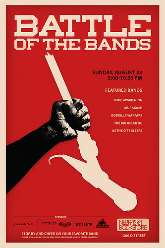
This one is very shout-y and not very creative, there is a logo at the top and a few company logos at the bottom but the rest is just impact in a dull black and darkened red. This is the kind of poster i dont want, its too boring and not inspiring and i wouldn't expect good artist to jump at this opportunity however it grabs your attention straight away with "IN A BAND?" which is its only good feature.
----------------------------------------------------------------------------

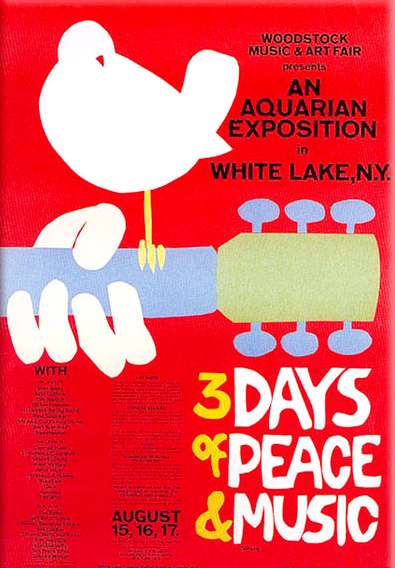
This poster is screams out for attention with the bright colours used, the title font is something cool and the yellow guitar gives the top part a good look. The subtitle explains what the advert is about so that straight away you know what its about, the 4 column grid system for the additional text looks clean and fits in well. The contact information is easily seen with the event logo being very visible, the layout works great as your eyes are drawn into the top and work their way down which is exactly what is intended.
----------------------------------------------------------------------------


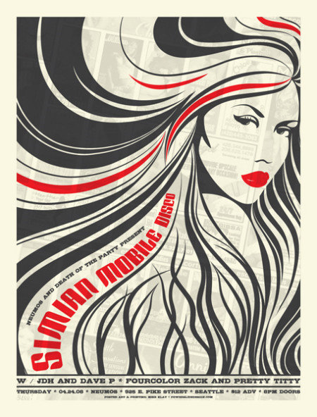
What i like about this is the fact that you know its for a rock band by just looking at it, it really shows off the style with the dark colours, the gothic looking font and images. This poster is very blunt theres not much text but the main title and text following give you most of the information you need but i feel that some may see this and not want to put the effort in to go online and view more, I feel because we want artist to ive track we cant get put anything that would put them of and this teaser poster might.
----------------------------------------------------------------------------


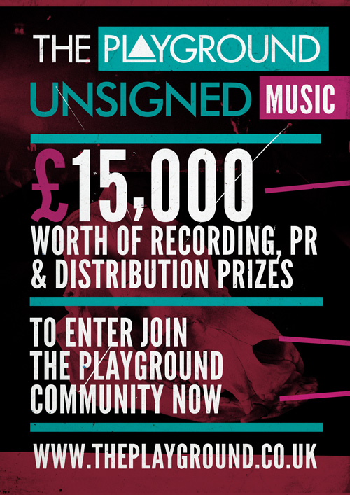
I like the colours used on this - neon/Florissant colours which have been slightly darkened this goes well with the nightclub theme going throughout the design. The company logo is at the top so you see it straight away, the main aspect of drawing attention is the largest - the £15,000, the text used is very simple and its straight in straight out approach. The poster is like the one above but with a feature that will make the artist want to find out more which is the prize money but i feel this could be anything.
----------------------------------------------------------------------------


This is an ad online, its not the best designed and the message isnt very attractive, this would have only taken a few minutes to produce and you can tell very easily. I dont think this would have got many responses.
----------------------------------------------------------------------------


This is an online banner and it looks much better than the one above, the metallic looking text and background combined with the Florissant mist give it a cool look, i think band members would be drawn to this. This wouldn't be to hard to create as the text just has a few filters. This says nearly the same as the one above and it looks much better.
----------------------------------------------------------------------------


This online advert looks like its been designed to load fast due to the lack of colours and design however its a small space to work to and it gets the message across. The company logo is easy to see and the ad is in the corporate colours and font.
----------------------------------------------------------------------------


This is the best online ad ive seen because you can tell straight away its a music advert, a key element to that is the amp as the background which also relates to the company as they sell amps. The message is very clear and it also tells you the rewards in specific detail, the sponsors are also shown.


SilentCities


"There are many silent voices in society – isolated, demonised or unheard. Silent Cities is a new social enterprise which aims to build creative environments where silent voices can flourish.
We formally incorporated in March 2010. We plan to pilot a range of activities locally (Silent Sheffield) before rolling out/licensing the successful frameworks, products and services nationally/across the world.
The types of activity include:
1. Empowering communities through:
  • Digital media projects  – eg DIY Community films, the Silent Sheffield radio show, silent bloggers
  • Development, sale and licensing of digital media products
  • Creative volunteering opportunities
  • Training and development in digital media to empower disadvantaged communities, including workshops, intergenerational mentoring schemes and creative apprenticeships
  • Premises – affordable supportive work-based environments for emerging social entrepreneurs and creative sole traders – ‘Place at my table’.
2. Creative services for the third sector:
Provided by professionals supported by creative volunteers and silent apprentices, our services include:
  • Research of markets, spotting of opportunities and selling of ideas and business plans to improve the services you offer.
  • Workshops – vision and values, customer segmentation, making your values visible, thinking creatively, board away days.
  • Promotional videos.
  • Branding and marketing materials.
  • Websites.
3. Creative Consultation
Innovative methods of public consultation for agencies city-wide."
Source: http://www.silentcities.org.uk/about/
Silent Cities is all about helping the "silent", those people who arent being heard and by creating opportunities they are able to combat this problem head on. They are helping people find their feet again or for the first time and have a big part in their lives, this type of charity isnt talked about much because its normally about collecting money for the poor but silent cities is about helping the everyday people out in life.

Proposal

The main issue i will address in this brief is the persona in which charities are viewed. I want to create a radical new style so that this charity can be seen with respect and appreciation rather than just a good deed, I am also going to use this opportunity to reach out and help silentsounds support unsigned bands, this is the charity giving them something back.

My plan for this project is to create an album which has unsigned artists music on, the album will be sent to the charities signed up (promotion for this project will go out before this to make charities aware) and the album will also be opened up to the public so that the unsigned bands can get promoted. This album should start becoming a privilege and more albums will be made with new submitted tracks, bands then see this as a must have and the charity starts to be seen in a different light.

I have broken my plan into 3 stages:
Stage 1 - Advertise to bands about this opportunity
               
Stage 2 - Album creation

Stage 3 - Brochure to charities stating what the project is about and how to sign up

Stage 3b - Advertise the created album to the public.

The albums if popular could be like the NOW thats what i call music style and each couple of months theres a new one with new music from the best unsigned artist.

The brief

The image below is explains what silentcities are all about..

Out of the 7 projects given i chose project 5 which is the "Silent Sheffield royalty free album"..

I have thought about what i can do with the brief and i have come up with an idea, i will post the proposal in the next post but heres my thoughts whilst thinking of the idea..
This was the original idea i then went into more..