This one is very shout-y and not very creative, there is a logo at the top and a few company logos at the bottom but the rest is just impact in a dull black and darkened red. This is the kind of poster i dont want, its too boring and not inspiring and i wouldn't expect good artist to jump at this opportunity however it grabs your attention straight away with "IN A BAND?" which is its only good feature.
----------------------------------------------------------------------------
This poster is screams out for attention with the bright colours used, the title font is something cool and the yellow guitar gives the top part a good look. The subtitle explains what the advert is about so that straight away you know what its about, the 4 column grid system for the additional text looks clean and fits in well. The contact information is easily seen with the event logo being very visible, the layout works great as your eyes are drawn into the top and work their way down which is exactly what is intended.
----------------------------------------------------------------------------
What i like about this is the fact that you know its for a rock band by just looking at it, it really shows off the style with the dark colours, the gothic looking font and images. This poster is very blunt theres not much text but the main title and text following give you most of the information you need but i feel that some may see this and not want to put the effort in to go online and view more, I feel because we want artist to ive track we cant get put anything that would put them of and this teaser poster might.
----------------------------------------------------------------------------
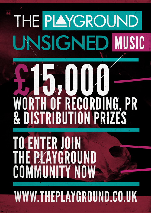
I like the colours used on this - neon/Florissant colours which have been slightly darkened this goes well with the nightclub theme going throughout the design. The company logo is at the top so you see it straight away, the main aspect of drawing attention is the largest - the £15,000, the text used is very simple and its straight in straight out approach. The poster is like the one above but with a feature that will make the artist want to find out more which is the prize money but i feel this could be anything.
----------------------------------------------------------------------------
This is an ad online, its not the best designed and the message isnt very attractive, this would have only taken a few minutes to produce and you can tell very easily. I dont think this would have got many responses.
----------------------------------------------------------------------------
This is an online banner and it looks much better than the one above, the metallic looking text and background combined with the Florissant mist give it a cool look, i think band members would be drawn to this. This wouldn't be to hard to create as the text just has a few filters. This says nearly the same as the one above and it looks much better.
----------------------------------------------------------------------------
This online advert looks like its been designed to load fast due to the lack of colours and design however its a small space to work to and it gets the message across. The company logo is easy to see and the ad is in the corporate colours and font.
----------------------------------------------------------------------------
This is the best online ad ive seen because you can tell straight away its a music advert, a key element to that is the amp as the background which also relates to the company as they sell amps. The message is very clear and it also tells you the rewards in specific detail, the sponsors are also shown.


No comments:
Post a Comment