This is normally the main event that looks for bands and will give me a good insight into getting across to bands.
This poster looks amazing, the images being focused around a guitar pick and a box of speakers give it a musical style straight off. The slanted type give it an urban/underground look and with the old paper texture in the background it supports that style, the colours also compliment each other. The company hosting this event is shown a couple of times ; firstly at the top then in the speaker box and finally the website at the bottom.
This advert broke up is; title of event, what benefits you, entering information, some musical style elements around and a sprinkle of the company name, A very simple formula.
----------------------------------------------------------------------------
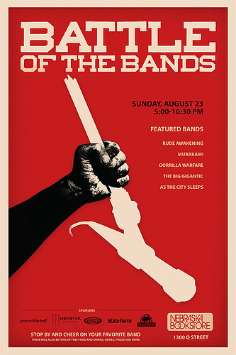
This event obviously is built around its sponsors and the poster shows that quite well. The event logo is eye catching and a good idea but its let down by the typography used, the 1st to 4th lines are the same size which makes it boring and not exciting like the poster above. The background gives it a great feel and encourages you to want to goto a event like this to experience the crowds. Overall this has the potential to be good but it seems lifeless in the way it gets the message across.
----------------------------------------------------------------------------
I dont know if this is a set of posters or 1 however as a set i think it could work well and with some additional text these posters could speak to musicians. The glow around the instruments and the vector line going some translates into "your time to shine" and also gives a feeling of showing your potential which i feel is very seducing feeling. The eroded typography seems to work great with music related designs.
----------------------------------------------------------------------------
This poster has too much text on it especially for a music event, i get no excitement off this at all. The design looks very "photoshop", the text is laid out badly, the contact info is all packed together and doesn't stand out and the sponsors logos are tightly packed which doesn't look good for them.
----------------------------------------------------------------------------
I really like this poster with the typography design its looks professional, the colours have a saturated drain on them, the background has a torn effect giving it a urban/underground/worn look which seems to be popular in music design. The serif font works great, the poster seems to be in one typography design with the event info just underneath and the event logo in the bottom corner.
----------------------------------------------------------------------------
A few more designs i looked at, these are not all looking for bands and are adverts for battle of the bands with bands already in but they have some good styles.


No comments:
Post a Comment