


I looked at charity albums because they always have a different vibe to them compared to normal albums, the ones above are some that i thought were interesting.
The top image confuses me because i dont know what the background is however the style looks great, the sprayed "help" looks insecure with the its crooked look.
The war child heroes has the same sprayed/stamp effect but this time with guns but with this one because they have used colours for the guns it does have a childish look to it. The font used is a fun/childish version of the army stencil, this album addresses its nature very well with the childish look.
The Haiti project album has a rough/destroyed look to it and this may resemble the way it is over their but this is a very simple cover with the red giving it a strong/bold look. I think the typography for "The Haiti Project" looks odd because i think its not the right emotion for the event its raising money for.
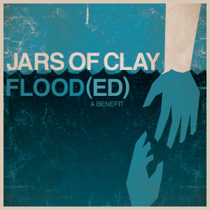
The Jars of clay poster is a good one in my opinion, it has a Saul Bass style and i think this style can fit any situation because its never too much and can say so much by being very simple.
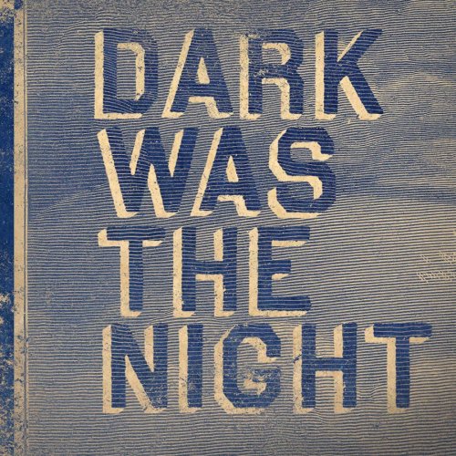
Im not too sure if dark was the night is a charity album but i found it whilst looking for them and i liked the style especially the used look it has and the typography.
No comments:
Post a Comment